
On February 6, 2026, the Dow Jones Industrial Average closed above 50,000 for the first time in history. Less than a hundred years earlier, on July 8, 1932, the same index closed at 41.22.
That’s the kind of fact people repeat at dinner parties. The Dow’s full ride from $41 to $50,000+. The crashes, the rebounds, the dot-com years, the 2008 panic. Everyone has an uncle who quotes it.
The problem is that most of the “common knowledge” about Dow Jones historical data is wrong, or at least incomplete. Including the one stat your uncle is most confident about.
Let me walk you through what 130 years of Dow Jones historical data actually says, and which “facts” to start ignoring.
130 years of Dow Jones historical data in one sentence: it usually goes up
The Dow Jones Industrial Average started life in 1896 with 12 stocks. Charles Dow averaged the share prices, divided by 12, and called the result “the industrial average.” The number that day was 40.94.
On May 8, 2026, the Dow closed at 49,609.16.
That’s the full story compressed: ~40 to ~49,000 across 130 years, with messy zigzags in between. Compounded, that works out to about 5.3% per year, the figure Warren Buffett once called “a wonderful century” when describing 20th-century US equity returns. You can pull the modern slice of this Dow Jones historical data series straight from the St. Louis Fed if you want the raw numbers.
If you reinvested dividends along the way, the number turns absurd. A $1 investment in the Dow in May 1896, with dividends reinvested, was worth roughly $84,000 by 2014, even though the price-only return on that same $1 was only about $437. Dividends matter. We’ll come back to this
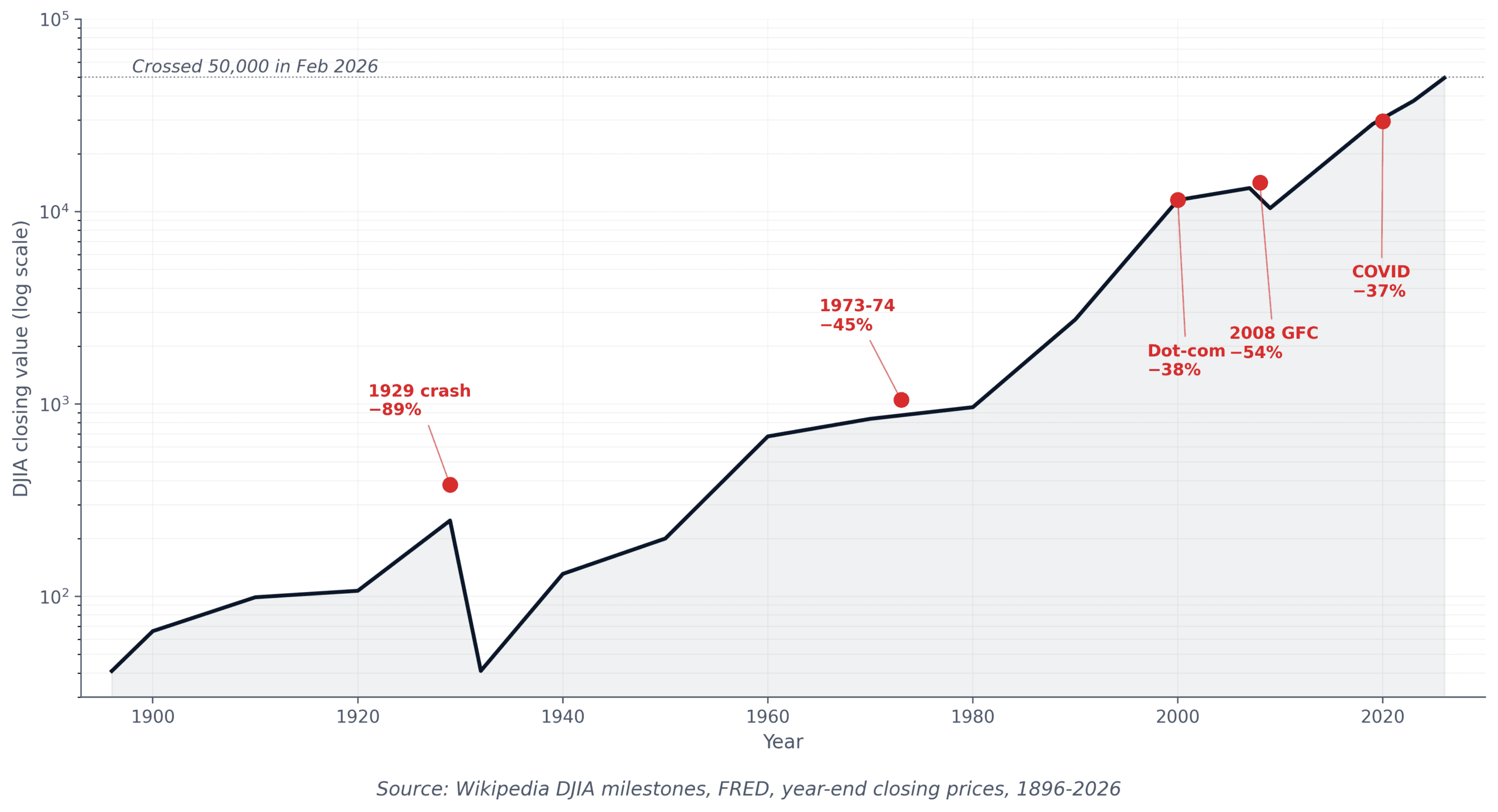
The 89% crash of 1929 and the 22-year recovery myth that’s mostly wrong
The most-quoted fact in Dow Jones historical data is this: “the Dow took 25 years to recover from the 1929 crash.”
It sounds devastating. It also isn’t really true.
Here’s what actually happened. The Dow peaked at 381.17 on September 3, 1929. It bottomed at 41.22 on July 8, 1932, a decline of about 89%. The price index didn’t return to that 381.17 mark until November 23, 1954, per the Dow’s official closing milestone record. That’s where the “25 years” number comes from, and it’s the version your uncle has memorized.
What he probably hasn’t memorized: the price-only number ignores two things that make the recovery look catastrophic when it wasn’t.
One: dividends. At the 1932 bottom, the Dow’s dividend yield was close to 14%. Investors who kept buying through the crash were collecting massive income. Stripping dividends out of long-term returns is like measuring a car’s speed but pretending fuel is free. The Dow Jones historical data with dividends reinvested tells a completely different story.
Two: deflation. The Consumer Price Index in late 1936 was about 18% lower than in late 1929. The dollar bought more goods, so the “real” purchasing power of a recovered portfolio was higher than the nominal price-only number suggested.
When Mark Hulbert ran the numbers for The New York Times in 2009 using Ibbotson Associates data that included dividend reinvestment and deflation adjustment, the actual recovery time for a lump-sum investor who bought at the 1929 peak was about 4½ years from the 1932 bottom, or roughly 7 years from the peak itself.
4½ years to recover from a 89% crash, not 25. The headline number every finance blog quotes is the wrong one.
This matters because the “25 years” version is the single most powerful argument people use to talk themselves out of staying invested. Once you know the math is wrong, the argument falls apart.
Dow Jones by year: a decade-by-decade view of where the money was actually made
The full year-by-year Dow Jones historical data is messy, but the decade view is clean. Here’s the simplified version:
| Decade | Start → End | Price-only return | What defined it |
|---|---|---|---|
| 1900s | ~66 → ~99 | +50% | Industrial expansion, Panic of 1907 |
| 1910s | 99.05 → 107.23 | +8% | WWI, exchange closure, post-war recession |
| 1920s | 107.23 → 248.48 | +131.7% | Roaring Twenties bull, then the 1929 peak |
| 1930s | 248.48 → 150.24 | −40% | Great Depression, 89% drawdown bottom in 1932 |
| 1940s | 150.24 → 200.13 | +33% | WWII, post-war reconstruction boom |
| 1950s | 200 → 679 | +240% | “Golden Age” American expansion |
| 1960s | 679 → 800 | +18% | Slowing growth, Vietnam, inflation start |
| 1970s | 800 → 839 | +5% | Stagflation, oil shocks (the “lost decade”) |
| 1980s | 839 → 2,753 | +228% | Volcker disinflation, Reagan bull, Black Monday |
| 1990s | 2,753 → 11,497 | +315% | Dot-com bull (12.3% annualized) |
| 2000s | 11,497 → 10,428 | −9% | Dot-com crash, 9/11, 2008 financial crisis |
| 2010s | 10,428 → 28,538 | +174% | QE recovery, longest bull run in history |
| 2020s (to May 2026) | 28,538 → 49,609 | +74% | COVID crash, recovery, AI bull, 50K milestone |
Two things jump out from this Dow Jones historical data. The 1970s and the 2000s are the only “lost decades,” meaning periods where the Dow went essentially nowhere or down. That’s 2 out of 13 decades. The other 11 produced returns ranging from “fine” to “outrageous.”

The other thing this Dow Jones historical data reveals: when the Dow has a great decade, it’s really great. The 1920s, 1950s, 1980s, 1990s, and 2010s each produced 100%+ price returns. None of the negative decades came close to wiping out the gains from the positive ones.
The Dow Jones historical data nobody quotes: bull markets are 4x longer than bear markets
Over 121 years through 2025, the Dow has experienced 5 secular bull markets and 4 secular bear markets. That alone is interesting. The duration gap is more interesting.
The four major bear cycles (1929-1949, 1966-1982, 2000-2009, briefly 2020 and 2022-2023) averaged roughly 7-10 years each. The bulls (1949-1966, 1982-2000, 2009-2020, 2023-2026) averaged closer to 15-18 years each. The numbers aren’t symmetrical and they aren’t meant to be.
This is the part of Dow Jones historical data that should reframe how a beginner thinks about “the market is risky.” Yes, the Dow has crashed. It crashed 89% once, 38% in 1973-74, 38% in 2008, and 38% in March 2020. But the average bear lasts a fraction of the average bull, and the recovery from each one has happened within the lifetime of an ordinary investor. The dividend-driven recovery math from the 1929 section explains why. For more on dividend math specifically, I broke it down in my honest dividend stocks breakdown.
59 swaps in 130 years: the Dow you bought in 2010 isn’t the Dow you own today
Here’s the survivorship-bias caveat nobody mentions when they cite Dow Jones historical data. The 30 stocks in today’s Dow are not the 30 stocks from 1896, 1929, or even 2010.
Per the Dow’s official record, the index has had 59 component swaps since 1896. General Electric, an original member, was removed in 2018. Walgreens Boots Alliance was kicked out in February 2024 and replaced by Amazon. In November 2024, Nvidia replaced Intel and Sherwin-Williams replaced Dow Inc.
What this means: when someone tells you “the Dow has returned X% per year since 1896,” they’re describing a constantly curated lineup, not a static portfolio. The committee at S&P Dow Jones Indices quietly removes losers and adds winners, which mathematically flatters the long-term return. It’s not a scandal, it’s how every major index works, but it’s worth knowing.
For a beginner, this matters in one specific way: you can’t replicate “the Dow since 1929” by buying 30 random blue chips and holding for 95 years. The index works because someone behind a curtain is quietly editing it.
What 130 years of Dow Jones historical data means for a beginner investor today
If I had to summarize the entire Dow Jones historical data set into useful takeaways for someone just starting out:
- Direction beats prediction. 11 of 13 decades produced positive returns. The probability that a 10-year holding period ends positively is high.
- Dividends are the engine. Price-only returns understate reality by an order of magnitude over long horizons.
- Crashes recover faster than you think. The 1929 crash recovered in ~4½ years on a real basis, not 25.
- The index is curated. The Dow’s historical return is partly the result of survivorship, not just buy-and-hold magic.
- Owning the index is easier than studying it. If this history convinces you you want exposure, the actual buying mechanics are in my Dow Jones ETF guide.
The single most useful thing 130 years of Dow Jones data teaches you is that boring, consistent participation beats most attempts to time the index.
This is also why broader, more diversified alternatives like VTI and VOO are often a better long-term core holding than the Dow itself. I covered the math in my VTI vs VOO comparison.
Here’s what I’d actually do
Read the decade table once. Look at it twice. Notice that the worst single decade, the 1930s with a 40% loss, is dwarfed by the average gain of the surrounding decades.
Then ignore the next “market is about to crash” headline you read.
If you want skin in the game, start small with whatever’s left after your bills, automate it monthly, and let the boring math from 130 years of Dow Jones historical data do its work. The mechanics for doing this with $25 a week are in my $25 starter plan.
The Dow has crossed 50,000 once. By the time someone reading this retires, it will have crossed 100,000, then 200,000, then a number that sounds insane today. That’s not a prediction. That’s just what the data has been doing since 1896.
Your uncle was wrong about 1929. He’s probably wrong about the next 25 years too.
Sources
- Wikipedia, Dow Jones Industrial Average (current revision, May 2026) — wikipedia.org
- Wikipedia, Closing milestones of the Dow Jones Industrial Average (current revision, 2026) — wikipedia.org
- Mark Hulbert, “25 Years to Bounce Back? Try 4½,” The New York Times, April 25, 2009 — nytimes.com
- Timothy Falcon Crack, “The Crash of 1929: How Long Did it Take the Dow to Recover?” SSRN (2025) — ssrn.com
- Morningstar, “What We’ve Learned From 150 Years of Stock Market Crashes” (March 2026) — morningstar.com
- Federal Reserve Bank of St. Louis, FRED database, DJIA series (2026) — fred.stlouisfed.org


Leave a Reply